
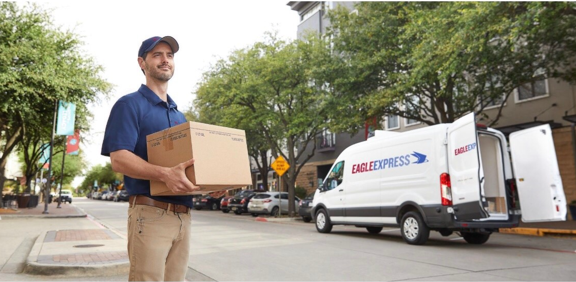
THE CLIENT
Eagle Express is a leading logistics and warehouse operator serving the Dallas–Fort Worth area, with over 40 years of experience.
THE NEED
With a dated logo and a mobile app launch on the horizon, Eagle Express needed an updated identity that felt modern while preserving key brand elements, specifically their recognizable eagle icon and signature color palette.
THE RESULTS
The refreshed logo strikes a balance between evolution and consistency, streamlined, clean, and aligned with the company’s reputation for speed and reliability. I led the client through a collaborative process, presenting multiple directions and refining based on feedback, ultimately landing on a bold horizontal lockup featuring the original eagle and dynamic motion lines. The final system extended into marketing collateral for the mobile app, reinforcing brand recognition across digital and print.
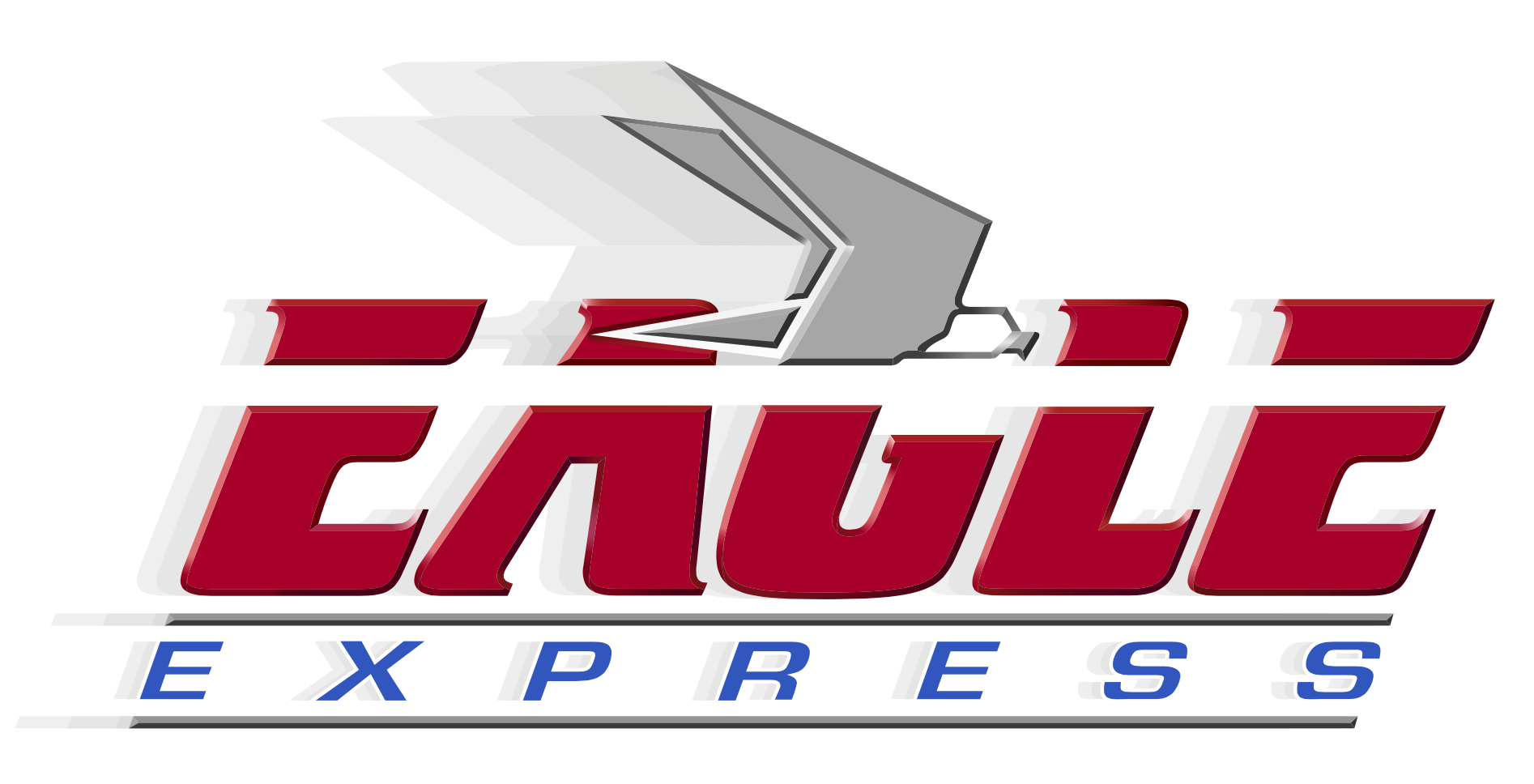
Before
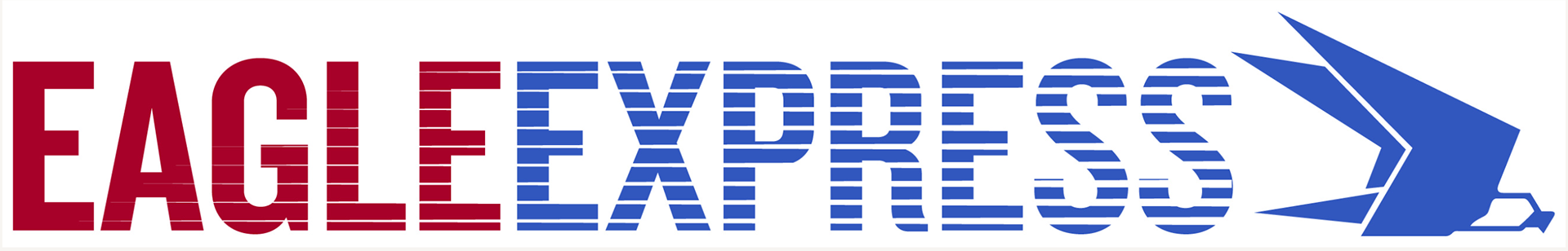
After
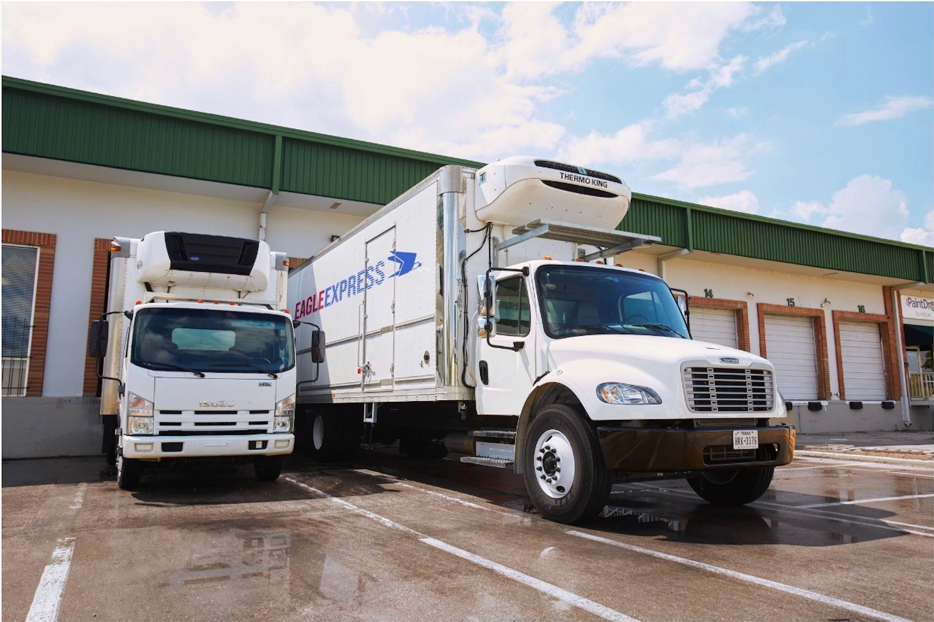
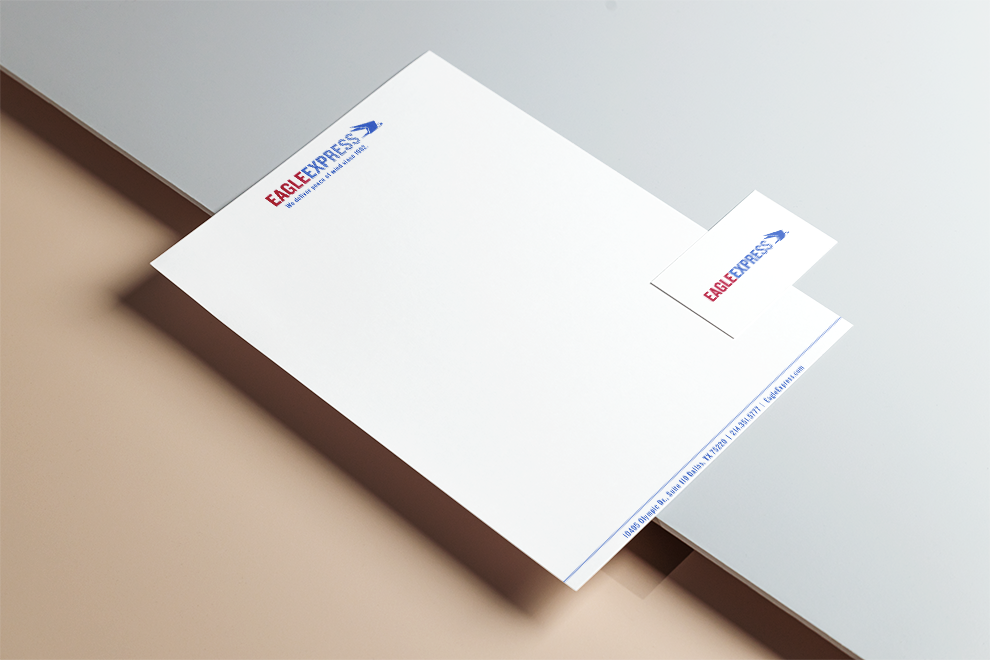
Client stationary